Open five SaaS websites right now. I’ll wait.
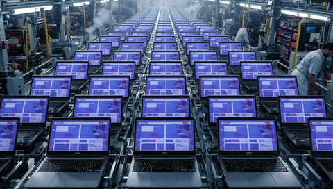
Back? Let me guess what you saw: Hero section with a gradient background. Sans-serif typography, probably Inter or something similar. Three-column feature grid with cute icons. Testimonial carousel. Pricing table with one plan highlighted as “Most Popular.”
You just looked at five different companies solving five different problems, but they’re visually indistinguishable. We’re in a creativity recession, and not enough people are talking about it.
The Template Reality
Every website looks the same because we’re all shopping at the same store.
The Stripe aesthetic infected everything sometime around 2019. Clean lines, gradients, nicely balanced whitespace. It’s beautiful. It’s also everywhere. We went from “make it look like Stripe” to every payment processor, SaaS tool, and AI startup looking like Stripe’s cousin.
Remember when websites had personality?
Sure, a long time ago, Flash was a dumpster fire for accessibility and SEO, but at least you could tell sites apart. That local restaurant’s Flash intro with the spinning pizza was terrible, but it was their terrible. Now they’re using the same Squarespace template as the law firm next door.
Even when I try to build something different, I catch myself reaching for the same patterns. The card component with the subtle shadow. The button with the 6px border radius. The navigation that collapses into a hamburger menu at exactly 768px.
We’ve optimized ourselves into visual monotony.
The Tool Convergence Problem
The tools were supposed to democratize design. They did. They also standardized it into oblivion.
Tailwind UI is gorgeous. Shadcn is practical. It’s also why every developer’s side project looks identical. We went from “CSS is hard” to “just use these pre-built components” and now everything looks like it came from the same factory. Which it did.
The paradox is stunning: We have more design options than ever before, but less variation in output. It’s like having a Pantone book with 10,000 colors but everyone picks blue.
The component libraries and design systems that promised flexibility delivered conformity instead. We all agreed to use the same building blocks, then acted surprised when our buildings looked identical.
The Speed vs. Creativity Tradeoff
Here’s the uncomfortable truth though... ship fast means use what exists.
Nobody has time to reinvent the card component. We’ve got features to build, users to acquire, revenue to generate. You want me to spend a week designing a unique navigation pattern? My competitor just shipped three features using off-the-shelf components.
That unique layout you spent months perfecting? It performs the same as the template you could have used on day one. Sometimes worse, because users are confused by your creative navigation.
I run sites that use basic components and building blocks and they work fine. The users don’t care that my design isn’t revolutionary. They care that the thing loads fast and does what they need. Design creativity is becoming a luxury we can’t afford.
Why This Actually Matters (Or Doesn’t)
We’re watching the death of digital craftsmanship in real-time.
When every restaurant website looks identical, nothing stands out. When every portfolio uses the same template, how do you judge the work? We’ve traded distinction for efficiency.
But maybe standing out is overrated.
Craigslist looks like garbage and still survives in the classifieds realm. Hacker News hasn’t updated its design in forever and every attempt to “improve” it fails. Reddit’s old.reddit.com is preferred by power users specifically because it’s ugly but functional.
Function won. Form lost. And maybe that’s fine.
Users don’t care about your creative layout. They care about finding the information they need and leaving. Your innovative navigation pattern isn’t delighting them. It’s frustrating them.
The AI Acceleration Effect
AI is pouring gasoline on this fire.
ChatGPT has written the same “10 Tips for Better Productivity” article approximately 10 million times. Every marketing page now has that same ChatGPT tone. Professional but hollow, comprehensive but somehow saying nothing.
Midjourney has a style and you know it when you see it. That slightly too-perfect, slightly too-saturated look. Every startup’s hero image looks like it came from the same prompt with different keywords.
Everyone’s using Claude to write their copy. Including me, sometimes. The result? We’re all speaking in the same voice, using the same structures, hitting the same beats.
Here’s where it gets weird. AI is now being trained on AI-generated content. The internet is filling up with synthetic content that all sounds the same, looks the same, reads the same. We’re creating a recursive loop of fucking sameness.
In five years, we might not even remember what human-made looked like. The baseline will be AI-generated, and everything will be measured against that synthetic standard.
The Creative Constraint Paradox
Constraints used to force creativity. The 140-character limit made Twitter poetry. The slow dial-up connections made developers optimize creatively. The black-and-white Game Boy screen made designers inventive. Limitations bred innovation.
Now we have infinite capability. Unlimited colors, unlimited space, almost unlimited computational power. And we gravitate to the same solutions anyway.
The template has become the new constraint, but it’s a voluntary prison. We could break free anytime, but we choose not to.
Try making something unique in Webflow. You’re still working within their system, their components, their logic. Even when you customize, it feels like Webflow. Bootstrap is the same story. No matter how much custom CSS you write, it still has that Bootstrap smell.
The tools that were supposed to enable creativity became the boundaries of it. Now, don't get me wrong, I love that these tools are democratizing design and enabling millions of people to share ideas online and build businesses, nothing wrong with that.
The Winners in the Recession
Some companies zagged when everyone zigged. Linear looks different enough to notice but not different enough to confuse. They found the sweet spot: familiar patterns with unique execution. It feels fresh without being alien.
There are still personal sites that said fuck it to best practices. They load weird, quirky, navigate a little strange, and look nothing like templates. They’re memorable specifically because they’re willing to be worse at conventional metrics.
The competitive advantage of looking “unprofessional” is real. When everyone’s professional, amateur stands out. When everyone’s polished, rough gets attention.
But these are exceptions proving the rule. For every creative rebel, there are 10,000 sites that look like they came from the same Figma file.
Building Through the Recession
So what do you do? Pick your battles. I follow the good old 80/20 rule: 80% conventional, 20% weird. Use the standard patterns for the boring stuff like navigation, forms, and basic layouts. Save your creativity for the parts that matter: the copy, the product, the actual value you’re delivering.
My approach is boring tech with interesting content. The wrapper doesn’t matter if what’s inside is valuable. Nobody subscribes to a newsletter for the email template.
The economics of being different usually aren’t worth it. That custom animation that took a week to build? Three people noticed. That standard carousel you dropped in? Works fine, took five minutes, nobody complained.
The Path Forward (Or Lack Thereof)
This probably doesn’t get better as we’ll develop nostalgia for “human-made” design the same way we have nostalgia for vinyl records or film photography. “This website was crafted by a human designer” will be a premium feature.
The next generation of internet users won’t know anything different. They’ll think this is what the web is supposed to look like. The sameness will be the standard.
Maybe that’s fine. Maybe efficiency and usability matter more than creativity and distinction. Maybe we were wrong to value unique design in the first place.
The real question is: does creativity matter if it doesn’t convert?
Embracing the Recession
I’m part of the problem and you probably are too.
Some of my sites use templates. My code follows patterns I’ve lifted from other projects. My writing has formulas I return to again and again. The stuff that works gets repeated.
But... I ship. And shipping beats being creative and invisible.
The person using a template who launches beats the person crafting custom CSS who never does. The generic-looking site that solves a real problem beats the beautiful site that doesn’t.
The creativity recession isn’t ending. If anything, it’s accelerating. Every new tool promises to make design easier but actually makes it more homogeneous. Every AI improvement makes the output more polished but less distinct.
We can fight it and probably lose. Or we can accept it and focus on the parts that actually matter: solving real problems, delivering real value, even if it all looks the same.
Your site looks like everyone else’s. So does mine. The difference is what we do with that sameness. The recession is here. Might as well get comfortable.

